


Taking Control of Contrast, Saturation and Sharpness is at the very heart of photography. When you shoot a photo on your camera one of two things happen. Either the camera saves the image as a Raw file or as a Jpeg.
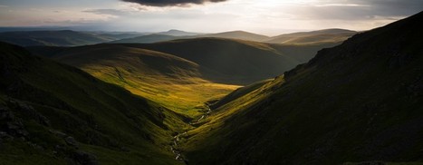
Contrast is the difference between the darkest and brightest areas of an image. The greater the difference, the greater the separation between the two. The highest contrast image possible would be the one in which the pixels in the image were either black or white, with no value in between. A love contrast image would see the values of the darkest and lightest parts close together. If you plan to adjust your Jpegs in postproduction, it will pay not to boost contrast too much in-camera.
Saturation defines a colors's intensity. The more saturated a color, the more vivid it appears to be. The less saturated a color the closer to grey it is. Some image controls often increase saturation on certain colors but leave others alone. Landscape mode often boosts the saturation of greens and blues for instance. As with contrast, there's no right or wrong answer to how saturated colors should be in an image; it largely depends on how you want your images to look.
Most digital sensors actually soften images slightly, using what's known as an anti-aliasing filter. THe filter is designed to stop (or at least reduce) the occurrence of an effect known as moire (this is seen as shimmering patterns in high0frenquency subjects such as fabric). When Jpeg is processed it's actually sharpened again by the camera. However, the sharpening is a visual cheat achieved be increasing the contrast between edges.


 Your new post is loading...


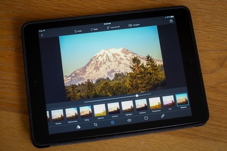


Understanding the fundamentals between sharpness, contrast and saturation or basic thoughts. Mastering them to the point where you culd eye ball them, when needed...especailly if you decide to switch your camera to manual...is a definite.