Your new post is loading...
The target audience for this letter-sized magazine is “anyone who stops and reads things on the street”.
The Los Angeles-based artist does self-portraiture on her own terms and in her own name.
Sculpture, web design, typography – whatever Kartik turns his hand to, there is an urge to let real world influences mess with standardisation.
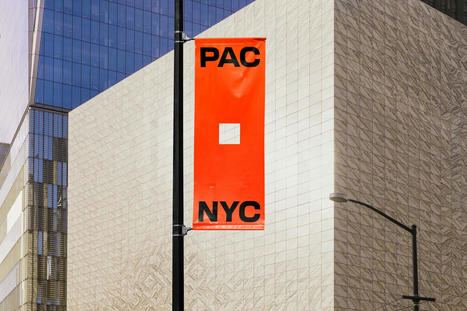
“We needed to radiate mass appeal,” says Porto Rocha, the graphic design studio tasked with encouraging visitors to the World Trade Centre site.
On a recent trip to Italy, our US editor-at-large became fascinated by the myriad forms of “folk” signage on display. Here, she asks why designers find it so easy to fall in love with mundane design abroad, but not closer to home.
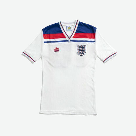
A new publication looks into the impact and legacy of Admiral, the brand that pioneered fan football shirts in the UK.
Be it historical writing systems inscribed on leaves or entirely new mediums all together, we explore how, in typographic design, the medium has always shaped the message.
The creative duo Rob & Robin have transitioned from graphic design to illustration; though they’re still borrowing a few tips and tricks from their old trade.
Gone are the days of the sleek thin sans; activewear brand Sweaty Betty debuts an identity system from Fluoro that stresses new brand message, “don’t sweat it”.
The graphic designer tells us that she sees “design from a designer’s perspective”, so how will her discarded logo sketch turned family of typefaces go down with others?
This product and campaign was created entirely in-house, proving why small budgets and limited tools can spark inventiveness.
With a flexible typeface, bold yellow colours and high-exposure flash photography, the Barcelona-based studio breathes new life into the eatery.
The platform is run and expertly curated by London-based graphic designer and archivist Diego Bucciero, who has brought the collection out of an old shoebox for everyone to enjoy.
|
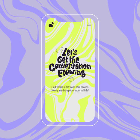
From Nice and Serious and in collaboration with Bloody Good Period, the website aims to make conversations about periods “flow” in workplaces.
In her first column, our Mumbai correspondent Payal Khandelwal cherry picks some standout Indian food and drink packaging designs that craft modern stories with cultural nuance.
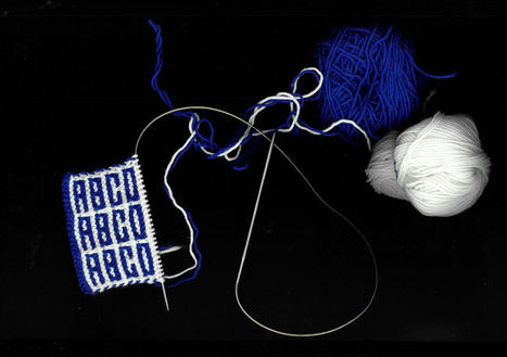
An old project on soccer fan scarves opened Rüdiger’s eyes to the possibilities of textiles. Now he prototypes typefaces on screen and fabric.
Leo Burnett Dubai agency has partnered with Omantel telecom network to create the Maqroo font, which translates to “readable”.
Grids and tight graphic systems provide comfort and safety to this artist working in Berlin.
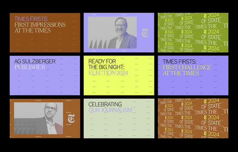
The branding for the State of the Times event, created by CC Studio in London, aims to celebrate the breadth of content and media that the newspaper produces.
The book explores the charity’s diverse artist commissions (such as Hurvin Anderson, Yinka Ilori and Shepherd Manyika) and celebrates its important work.
In this week’s POV, design director Jakob Weinzettel traces the growing trend of “the human alphabet” and how this visual language speaks volumes about designers’ collective obsession with the human form.
Art of the Title’s Lola Landekic speaks to the graphic designers behind titles and posters for some of this year’s biggest films, exploring the process and changing landscape for these creatives setting the tone of films through typography.
This fun-filled branding from the Berlin-based studio features tomato mascots, dental drawings, a typewriter font and even a scratch card.
The LA-based designer shares how the K.73r typeface was made within such strict rules, and why it’s named after one of Mozart’s canons.
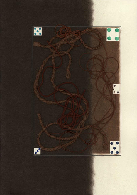
What happens when a typographic and fine art practice collide? Highly logical images that crumble under scrutiny.
|