Your new post is loading...
Planning towards a future foundry, Daytona Mess is currently on a master’s programme, passing out type handouts in the shape of swords in presentations.
“The project helped us reflect on how interconnected different writing systems are and how they are the result of long historic processes,” says co-founder Noël Leu.
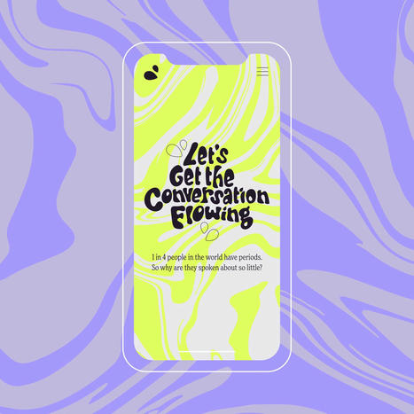
From Nice and Serious and in collaboration with Bloody Good Period, the website aims to make conversations about periods “flow” in workplaces.
Sculpture, web design, typography – whatever Kartik turns his hand to, there is an urge to let real world influences mess with standardisation.
Leo Burnett Dubai agency has partnered with Omantel telecom network to create the Maqroo font, which translates to “readable”.
Be it historical writing systems inscribed on leaves or entirely new mediums all together, we explore how, in typographic design, the medium has always shaped the message.
In this week’s POV, design director Jakob Weinzettel traces the growing trend of “the human alphabet” and how this visual language speaks volumes about designers’ collective obsession with the human form.
Art of the Title’s Lola Landekic speaks to the graphic designers behind titles and posters for some of this year’s biggest films, exploring the process and changing landscape for these creatives setting the tone of films through typography.
This fun-filled branding from the Berlin-based studio features tomato mascots, dental drawings, a typewriter font and even a scratch card.
What happens when a typographic and fine art practice collide? Highly logical images that crumble under scrutiny.
This year’s report sees innovative approaches to environmentally conscious design and greater consumer transparency.
As Instagram’s first refresh in over five years introduces an illuminated gradient and logo-inspired brand typeface, we speak to the design team about how the biggest challenges came typographically.
With no previous experience in type design, the Texas-based multi-disciplinary designer embarked on a whirlwind 15-week project to make four beautiful typefaces inspired by the history of houseplants.
|
Across everything from zines to textiles, the Sudanese, Brooklyn-based designer and artist creates work exuding affection.
The new visual identity plays with the ubiquitous arrow symbol and pairs it with bold typography and distinctive collage-style illustrations.
In her first column, our Mumbai correspondent Payal Khandelwal cherry picks some standout Indian food and drink packaging designs that craft modern stories with cultural nuance.
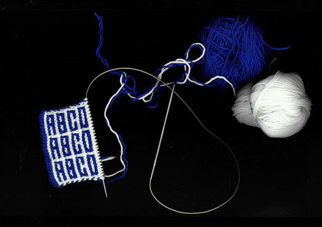
An old project on soccer fan scarves opened Rüdiger’s eyes to the possibilities of textiles. Now he prototypes typefaces on screen and fabric.
On a recent trip to Italy, our US editor-at-large became fascinated by the myriad forms of “folk” signage on display. Here, she asks why designers find it so easy to fall in love with mundane design abroad, but not closer to home.
The book explores the charity’s diverse artist commissions (such as Hurvin Anderson, Yinka Ilori and Shepherd Manyika) and celebrates its important work.
Gone are the days of the sleek thin sans; activewear brand Sweaty Betty debuts an identity system from Fluoro that stresses new brand message, “don’t sweat it”.
The graphic designer tells us that she sees “design from a designer’s perspective”, so how will her discarded logo sketch turned family of typefaces go down with others?
This product and campaign was created entirely in-house, proving why small budgets and limited tools can spark inventiveness.
Growing up in a small rural village, Pedro’s work is now full of moss-like lettering and rocky type.
Working under the name Bollo, the Bern-based designer tells us how working with musicians helps him to break conventional design rules and restrictions.
The Paris-based graphic and type designer shares his wisdom on the importance of type in films, arguing that it should be considered, along with sound and image, as the third crucial element of cinema.
|